Design Tokens 101: From Theory to Production
The practical guide. W3C format, three-tier architecture, Tokens Studio workflow, and the exact file structure we use to run four Edition palettes from one source.
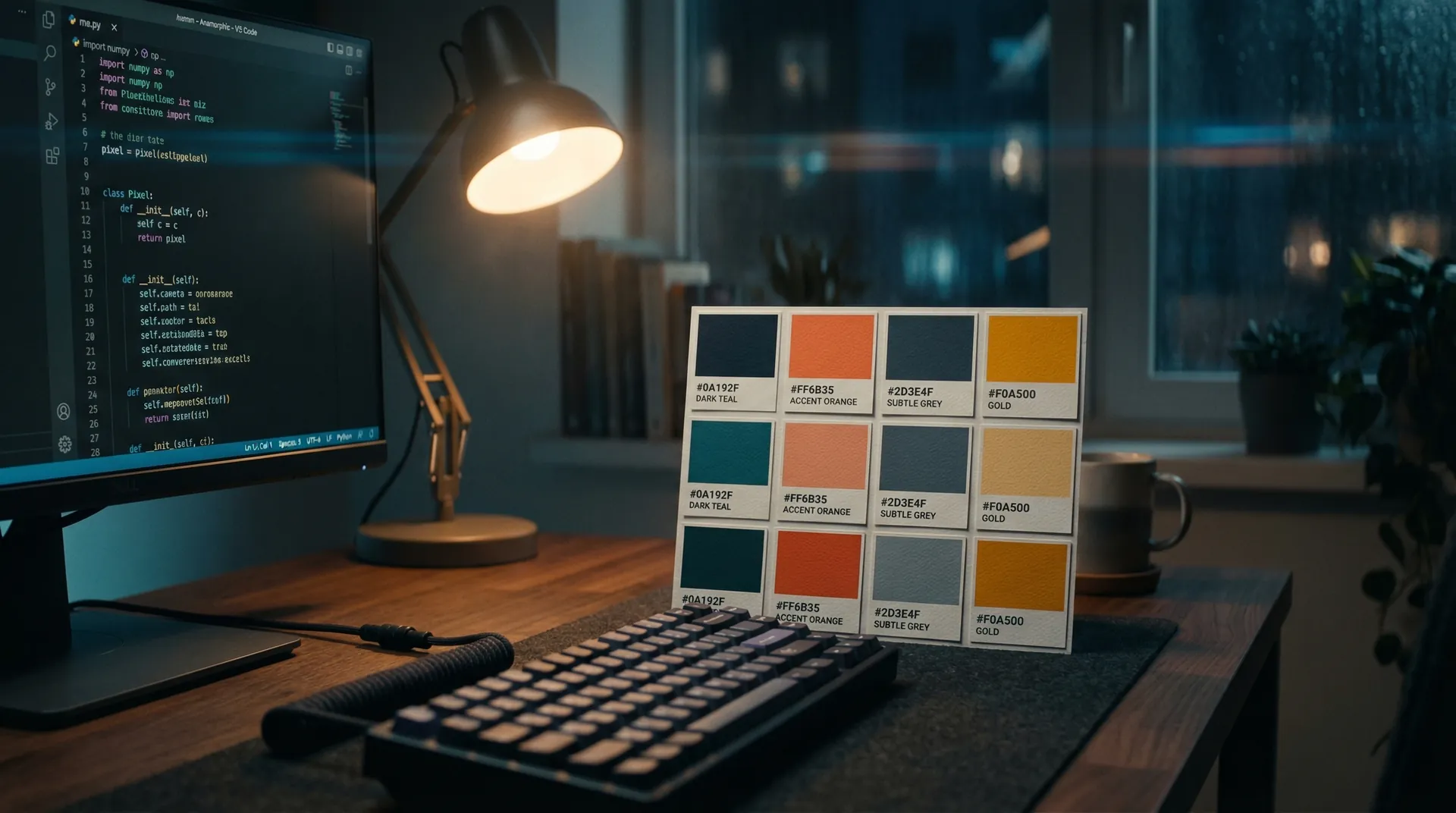
A design token is a named value that stores a design decision. Instead of hardcoding #C9A227 in twelve places, you define "accent" once and reference it everywhere. One edit, global propagation. When a new developer joins, they type "accent" — not a hex code they found in a Figma screenshot from three months ago.
The Six Token Types You Need
- Color — bg, surface, accent, text, border, diagnostic states (critical, healthy, signal)
- Typography — font families, clamp() sizes for fluid type, weights, line heights
- Spacing — section padding (120px), container max-width (1200px), component gaps
- Motion — a single easing curve used everywhere, three duration tiers (fast, base, slow)
- Radius — from 6px button corners to 9999px pill shapes
- Breakpoints — sm (640), md (768), lg (1024), xl (1280) — shared by every component
Components Get the Attention. Tokens Do the Work.
A button without tokens works in one context. A button built on tokens adapts to dark mode, light mode, four Edition themes, and every responsive breakpoint — because its values are inherited, not hardcoded. Our token file defines the entire visual language in a single file. Four distinct Edition palettes extend the same base. No duplication, no drift.
Three-Tier Architecture
- Global tokens — Raw values. "#C9A227" is a global token. The atoms.
- Alias tokens — Semantic names. "accent" points to "#C9A227". This is where values become decisions.
- Component tokens — Scoped references. "button.background" points to "accent". This connects decisions to UI.
Most teams stop at globals. The alias layer is where the leverage lives — change "accent" once and every CTA, eyebrow, hover state, and chart highlight updates simultaneously.
Tokens Studio + Framer Workflow
Tokens Studio reads W3C DTCG format JSON and syncs it into Framer as live styles. Here is the workflow:
- Define tokens in alo-tokens.json — W3C DTCG format ($value, $type, $description)
- Import into Tokens Studio — it creates synced style sets from the JSON
- Create sets per Edition (RED, CONCRETE, VELVET, VOID)
- Apply contextually — one button, four Edition appearances, zero duplication
- Push to Figma or Framer — tokens propagate to all linked components
The W3C Format
The W3C DTCG format uses JSON with $value, $type (color, dimension, fontFamily), and $description. We publish 120+ tokens across 7 groups at /alo-tokens.json. Download it. Study the structure. Fork it for your own system.
A system without tokens is a suggestion. With tokens, it is a contract — and contracts scale.